
Contents
- The High Cost of Flooring Remorse
- What Flooring Do Interior Designers Advise Avoiding?
- What Flooring Mistakes Should I Avoid For Day To Day Durability?
- What Flooring is Outdated?
- Should Your Flooring Be Lighter or Darker Than Your Walls?
- What is the Rule of 3 in Flooring?
The High Cost of Flooring Remorse
Flooring isn’t like a coat of paint. If you pick the wrong paint colour for your living room, you’re out £50 and a weekend of your time. If you pick the wrong flooring, you’re out thousands of pounds, stuck dealing with messy torn up subfloors, and forced to live with a mistake you step on every single day!
Whether it’s high-maintenance finishes that mean you have to clean, sweep and vacuum constantly, or outdated shades that instantly rob your home of warmth, flooring remorse is incredibly common.
To save your budget and your sanity, we at Funky Flooring have broken down the most common flooring mistakes homeowners regret… alongside the expert interior design rules you need to get it right the first time.
What Flooring Do Interior Designers Advise Avoiding?
If you ask a professional interior designer what makes them cringe, it usually isn’t a lack of budget: it’s choices that look sterile, dated or completely impractical for real life.
Here are the top three offenders designers constantly advise clients against:
- Monochrome Cold Grey Laminate: Popular throughout the late 2010s, modern interior design has firmly moved away from flat, blue-toned grey wood effect. It makes homes feel clinical and washed out.
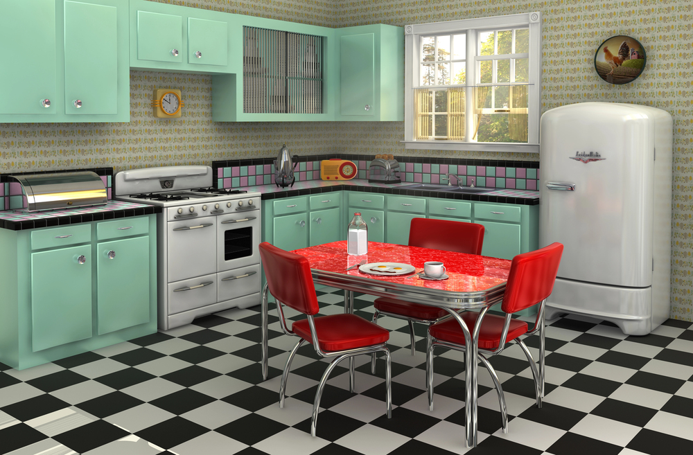
- Ultra-High Gloss Finishes: Shiny black or white tiles look sleek in a showroom, but in a real home, they highlight every single footprint, pet hair, smudge, and micro-scratch under natural light.
- Thin Renters Beige Carpet: Standard, low-density beige carpet lacks character, flattens out in high-traffic hallways within a year, and acts as a magnet for permanent stains. Often called renters carpet because the cheap, bland carpet is a favourite amongst landlords to keep costs down and the place looking neutral.
The Fix: Move toward warm neutral undertones such as honey oak, warm greige, and rich walnut, paired with matte or satin textured finishes that hide daily wear and tear.
What Flooring Mistakes Should I Avoid For Day To Day Durability?
Most flooring regrets don’t stem from the material being inherently problematic, they come from placing the wrong material in the wrong environment.
Mistake #1: Prioritising Aesthetics Over Room Function
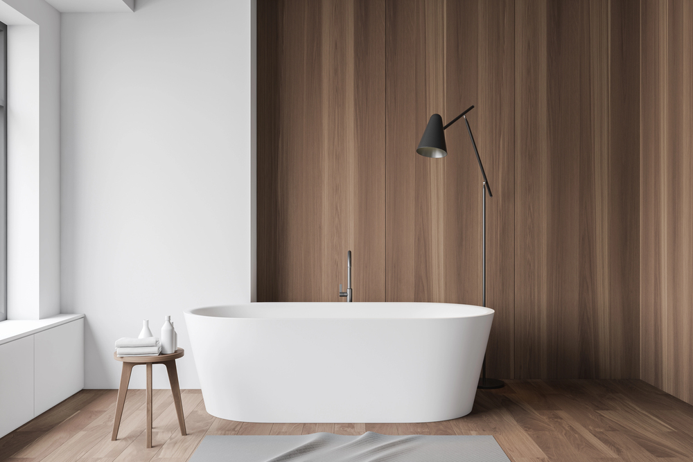
Installing delicate real wood in a splash-heavy bathroom or high-moisture utility room will inevitably lead to warping, cupping, and costly water damage. Always align the material with the humidity and traffic of the room.
Mistake #2: The Sauna Effect (Matching Wood to Wood)
Trying to match your wooden floor directly to your wooden dining table, doors, and cabinets creates a flat, visually suffocating space. Aim for subtle contrast between your floor tone and your furniture timber.
Mistake #3: Ignoring Natural Light
Pitch-black wood floors look incredibly striking in design magazines, but in a room without massive south-facing windows, they absorb all available light, making the space feel claustrophobic and perpetually dusty.
How Room Orientation Affects Your Flooring Choice
Before locking in a finish, take a look at which way your windows face. Light quality drastically alters how flooring looks once laid:
- North-Facing Rooms: These spaces get cooler, flatter light. Avoid blue-toned greys or stark whites, which turn cold and gloomy. Reach for warm honey tones, golden oaks, or rich terracotta tiles to bounce warmth back into the room.
- South-Facing Rooms: Blessed with intense natural sunlight, these rooms can handle cooler slate tones, dark walnuts, and rich espresso woods without feeling dark.
What Flooring is Outdated?
Trends evolve, and certain styles that dominated past decades are officially reaching their expiration date.
| Outdated Choice | Why It’s Regretted | The Modern Alternative |
| Cool-Tone Grey Wood | Looks flat, cold, and dated. | Warm Greige or Natural Oak (brings warmth back). |
| High-Gloss Black/White Tile | Impossible to keep clean; shows every smudge. | Matte Patterned or LVT Tiles (hides daily dust). |
| Tiny Grid Mosaics | Cleaning miles of grout lines becomes a nightmare. | Large Format Tiles or LVT (fewer grout lines). |
| Wall-to-Wall Plain Carpet | Flattens fast and holds onto allergens. | Textured Loop Carpet or Hard Flooring + Area Rugs. |
Should Your Flooring Be Lighter or Darker Than Your Walls?
One of the most frequent questions homeowners face during a renovation is about flooring darkness and contrast with your walls.
As a general rule of thumb:
Go Lighter With Your Floors If:
- You have a small room or low ceilings and want to reflect light upward to create the illusion of extra floor space.
- Your walls are painted in dark, moody colours like navy, dark green or charcoal, and you need a grounding contrast to balance the room.
Go Darker With Your Floors If:
- You have a massive, open-plan space with tall ceilings that feels a bit echoing or empty. Darker floors anchor the room and make it feel instantly cosy.
- Your walls are bright white or light neutral, creating a timeless, high-contrast framing effect.
What is the Rule of 3 in Flooring?
The Rule of 3 is a foundational interior architecture principle designed to prevent visual chaos across a house layout.
The rule states that you should have no more than 3 distinct flooring materials visible across the main connected areas of your home, such as a ground floor layout or main hallway sightlines.
If a guest stands in your hallway and can see oak laminate in the lounge, grey carpet on the stairs, blue tile in the kitchen, and reddish wood in the dining room, the home feels fragmented and smaller. Sticking to 1–3 continuous, high-quality materials creates a cohesive flow that visually stretches your floor plan.
Final Thoughts & Getting Inspiration
Choosing new flooring should be an exciting chance to show off your personality, not a source of decision fatigue.
The trick is simply finding that sweet spot between everyday practical resilience and a style that makes you happy every time you walk through the door.
Take your time comparing samples under your home’s actual lighting, test them against your foot traffic, and explore creative pattern ideas to find a look you will love for years to come.